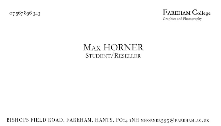
In today’s lesson we were asked to examine the typographical elements of ‘Patrick Bateman’s’ business card and recreate it in Photoshop. I first searched for the font used in the scene online but I couldn’t find anywhere to download it so I started to go through all of the different fonts until found one that was extremely similar. Conveniently enough this was the last font on the list called ‘St Song’. I then wrote his name on the business card but I couldn’t write the numbers in the same font so I started looking through some other fonts and finally found the exact one that I needed.


nice
LikeLike
good text spacing and overall copy of the original.
LikeLike