In today’s lesson we got string and glued it onto our paper, I chose to lay my string out in the shape of the off white logo. I did this because it is symmetrical and therefore I think that it will look better in a stamp format. I then went over it multiple times with purple ink and then stamped it onto another piece of paper. 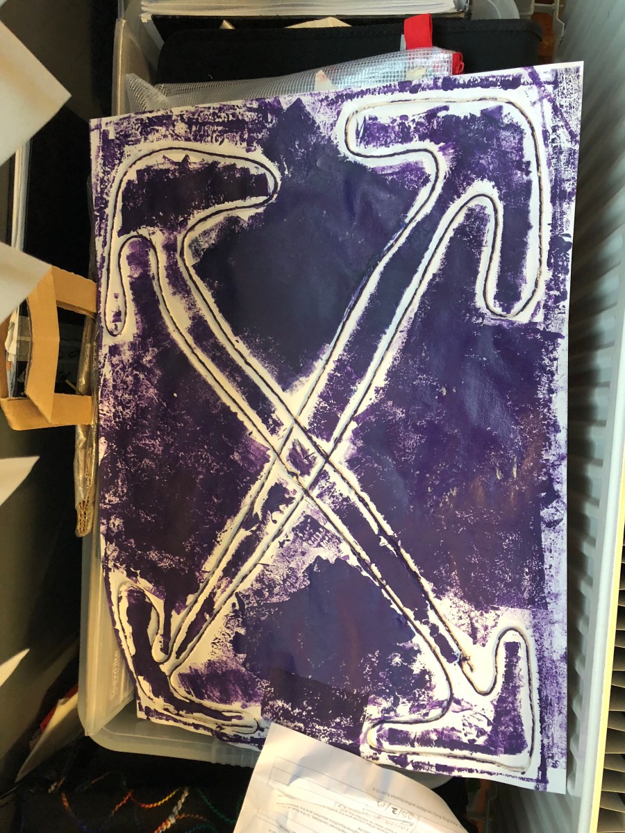
Author: maxhorner21
We have made a face mask and a bag for our model to wear. We also decided to add my shoes as they have the same distressed look to the outfit.
The outfit will be styled as if it was a casual outfit but for one of the photos I want to have the model with his hands in his secondary pockets to show that his arms can hang straight by his sides and not swing around instead of the weird angle that they normally bend at in the normal positioned pockets.
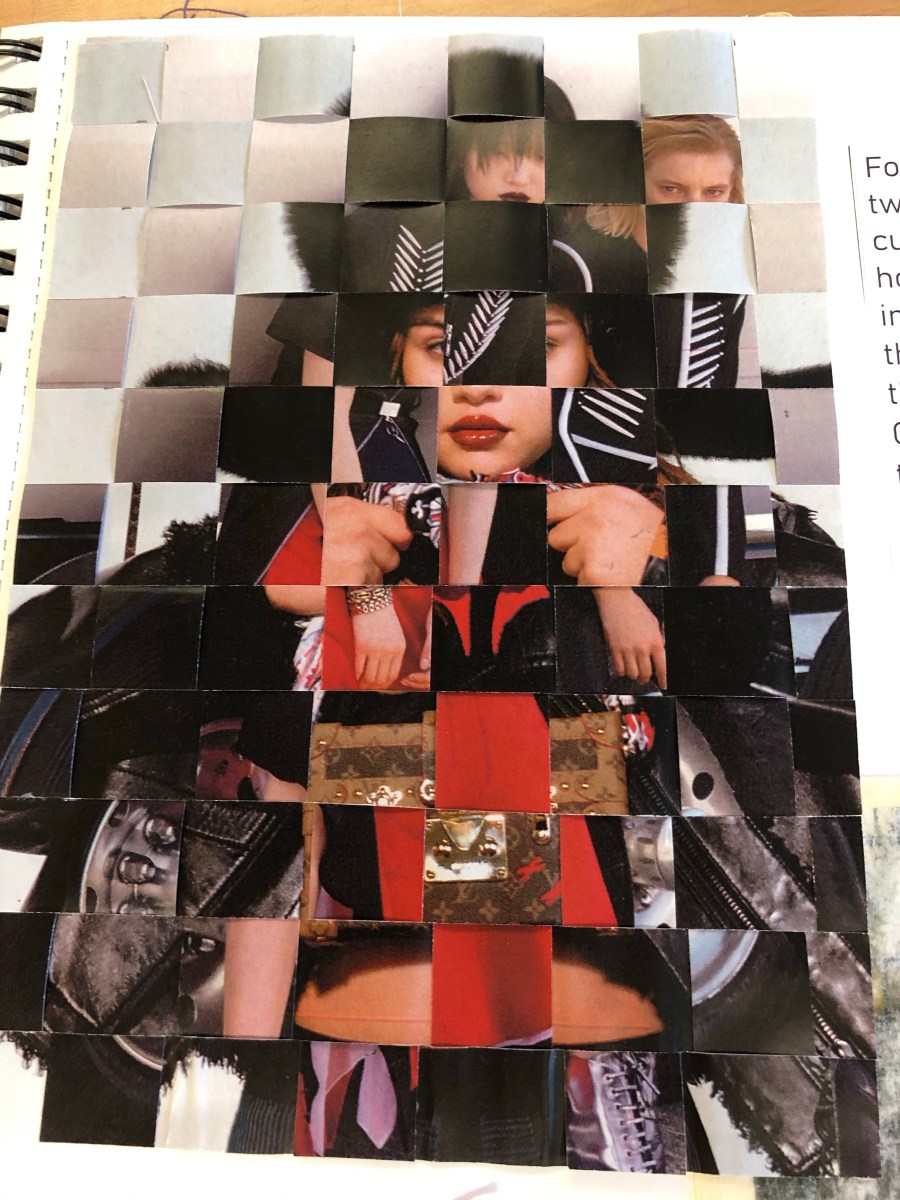
In today’s lesson we learned how to weave two images together to create an overall bigger combined image.
Unfortunately mine didn’t work very well as I forgot to leave the ends of the paper together and cut the full length of the paper. Below there is an example of what it would’ve looked like if it had worked and then what mine now looks like as it ripped as I tried to do it.
The good thing is that I have learned what not to do in terms of leaving the ends attached and now if I ever need to do it again in the future I know how to.

- Left sleeve of grey hoody
- Right sleeve of grey hoody
- Hood of grey hoody
- Two sides of the zip from grey hoody
- The zip from the grey hoody
- Two halves of the front of the grey hoody
- Two halves of the back of the grey hoody
- Two cuffs from the sleeves of grey hoody
- 2 Drawstrings from grey hoody
- Collar of grey hoody
- Navy Left sleeve of tee
- Navy right sleeve of tee
- 2 navy cuffs of tee
- Two white halves of the front of the tee
- Two white halves of the back of the tee
- White Collar of tee
- Waist band of grey jeans
- 2 front pockets of grey jeans
- 2 back pockets of grey jeans
- 2 halves of the back of the grey jeans
- 2 halves of the front of the grey jeans
- A lot of leftover threads
In today’s lesson I learned how to do tie die, to do this we took elastic bands and put them around screwed up pieces of calico. I wanted to go a bit further so I also included a technique called Shibori on mine so that after it had dyed I would have button shapes on the dyed parts. This worked really well as seen in the picture below.

In today’s lesson we were asked to find an image and edit it into a different background using the clipping tool on illustrator. I chose to use the lady walking as I felt hat I could most accurately add her into an image whee thee are other people walking, this is why I chose the image that I did. I decided to use Photoshop instead of illustrator as I am more experienced on Photoshop and I knew that it would not effect the standard of the edit.

In today’s lesson we learnt how to screen print. First we had to put ink straight onto a screen and then rolled it over the top of the calico which had our design rested over the top of it. This then allowed the ink to get onto the calico around my design.
I personally think that mine came out pretty well apart from the little bit of the square that sticks out either side. That is where I left the tape on by accident.

In today’s lesson we learned how to use wax to stop ink from staining certain parts of our fabric. This process is called Batik.
Firstly we heated up the wax pellets and then mixed them until it was a liquid.
Secondly we dropped the wax around the fabric creating an image on the fabric. We did this to so that the wax would act as a layer over the fabric therefore not allowing the ink to get onto that select part of the fabric. We then dyed the fabric which allowed for our design to stand out more than it did with it being in wax. After we dyed the fabric we then allowed it to dry on the radiators. Next we had to iron off the wax revealing the image in white underneath, I personally didn’t do this as I wanted to show the process. This doesn’t matter as the wax is clear and you can still see the design through it.
Colour Tones – A tone is produced either by mixing a colour with grey, or by both tinting and shading.
Cut/Line – The caption to a photograph or other illustration,
Shape/Silhouette – The dark shape and outline of someone or something visible in restricted light against a brighter background.
Dimensions – A measurable extent of a particular kind, such as length, breadth, depth or height.
Pattern – A repeated decorative design.
Texture – The feel, appearance, or consistency of a surface or a substance.
Gradient – A term used to describe a fluid range of colour filling an area.
Bold – Having a strong, vivid or clear appearance.
Simple – Without much decoration or ornamentation.
Quirky – Having peculiar or unexpected aspects.
Modern – Relating to the present or recent times as opposed to the remote past.
Elegant – Graceful and stylish.
Tailored – Smart, fitted and well cut.
Classic – elegant style, not really subjected to changes in fashion.
Colourful – Having much of varied colour; bright.
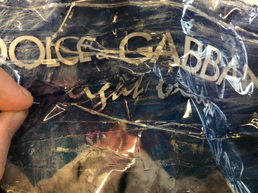
In today’s lesson we transferred an image onto cello tape.
To do this I firstly had to take an image and then tape over the top of it until it was fully covered. After that I started to add water to the paper using a paintbrush to gently rub of the paper. On some parts I pressed to hard taking the paper and the print off. After all the paper was off I was left with just the design that was on the page onto the tape.
 Fashion Blog by Max Horner