Different types of seams

Super imposed seam:

This seam is created by two or more pieces of fabric being sewed together. It is one of the most commonly used seams. The fabric ends in the same direction and it has over 50 different variations.

Image result for super imposed seam

Lapped seam:

This type of seam is created when two or more pieces of fabric coming from opposite directions overlap each other. This seam is very strong.
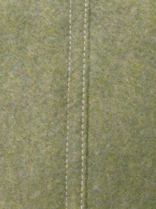
Image result for lapped seam

Bound seam:

A bound seam is when one piece of fabric surrounds the edge of another piece of fabric. The purpose of bound seam is to finish an edge of the garment. It is sometimes used to decorate the edge. There are 18 different variations of the seam.

Image result for bound seam

Flat seam:

Flat seams are constructed by having two pieces of fabric meet precisely on their edges. Using this seam decreases the seams thickness creating a nicer look.

Image result for Flat seam

Decorative seam:

This type of seam is made by making multiple stitch lines in one or more layers of fabric. A multi needle sewing machine is used to create this seam. These seams are only used for decorative purposes.

Image result for decorative seam

Plain seam

In a Plain seam two fabrics are joined together along the seam line by a  line of stitching. It is also sometimes called a single needle Butterfly stitch.

Image result for plain seam

Hairline seam

This is an enclosed seam which is mostly used for collars. The seam isn’t visible from the outside as it gets enclosed creating a more aesthetically pleasing look.

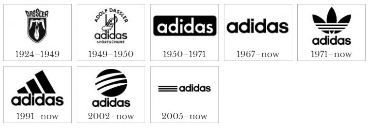
Image result for hairline seam


Why I want to do Fashion

I want to do Fashion because it will help me when I design and make my own brand. I want to learn how to make the clothing as well as designing it so that I can give my customers the best products that I can. My main aim for when I have finished the two year course is that I will be able to make almost all pieces of clothing. I will achieve this by staying after lessons to use the sewing machine and doing extra research at home. At the end of the course I would like to have my brand/brands up and running and I would like to be making all of the clothes that i will be selling and not making them through third party companies that will then ruin my profits. Fashion will help me with doing this by teaching me how to design all of the different elements of the item of clothing and then how to carry out making the item of clothing. Once I have finished my work experience I will look into places that make clothes and try and get a part time job in one of them to help improve my skills to keep me ahead of the class. Also I might turn it into a full time job after the course has finished to keep up the consistent stitches in my clients clothing. I want my brand to be a big designer brand one day so I will need to keep up the good quality throughout making it. Fashion and my job if I get it will help me with this by improving my consistency. My work experience placement will help me a lot when deciding what I want to do when I finish my course.

Adidas and the evolution of its logo

Adolf Dassler nicknamed ‘Adi’ made a company with his brother Rudolph Dassler in 1924 called ‘Dassler.’ The two brothers decided to split up and make their own companies in 1947, they both decided to combine their first names and last names together creating Adidas AG and Ruda. Adidas AG became Adidas a year later in 1950 and Ruda became Puma.

The core of Adidas’ logo was the 3 stripes, originally the 3 stripes were invented by the owner of a Finnish company called Karhu Sports. Karhu Sports were experiencing financial issues due to WWII they agreed to sell the three stripes to Adidas for the equivalent of €1,600 and two bottles of whiskey.

The majority of Adidas’ logos are timeless and will always work for the company unless it has a complete overhaul which I doubt will happen. Out of the 7 logos Adidas have had they still use 5 of them and will do for many years to come.Capture

Adidas links to what I want to do when I finish my course perfectly as I also want to create my own brand from nothing to one of the best in the world. The creator of adidas, Adolf Dassler created the brand from nothing by making pairs of shoes in his own time. This is what I want to do but I want to make clothes as well and build a designer brand like the current brands Gucci or Goyard.

Adidas’s brand status has increased significantly over the last few years increasing the companies previous net worth by 533% in just four years. They have now employed over 57,000 people. Annually Adidas produces over 900 million products and 400 million of them are pairs of shoes. They currently have 1,380 stores around the world.

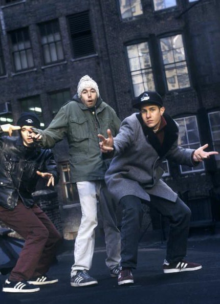
Adidas Gazelles played a massive role in adidas’s rise to the top, luckily for adidas celebrities such as Kate moss, Michael Jackson, The beastie boys and the members of Oasis quickly favourited the shoes. Adidas gazelles quickly picked up in popularity as the fans of these popular celebrities would want the same shoes as soon as possible.

adidas Gazelle Subculture History
The Beastie Boys wearing their Adidas Gazelle’s

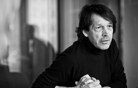
Peter Saville

Peter Saville 

Peter Saville is one of the most popular British graphic designers. He gained a lot of his popularity by designing record sleeves for Factory Record, while serving as art director of the studios. In 1978 he had a meeting with Tony Wilson, the owner of a famous record label which entered him into the music industry. He was then commissioned to make the record labels first poster. After the poster went down well with the public he carried on working for the label and later on became a board member for them. He designed record sleeves for VIP clients such as Joy Division and New order.

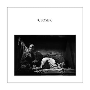
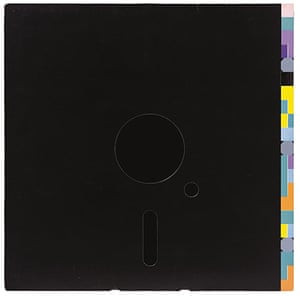
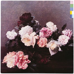
I personally think that his designs are very cleverly created and that he is extremely creative when designing them. The free space on the Joy Division logo enhances your view onto the main logo therefore making it stand out more and actually making people look closer at the record sleeve instead of just skipping past it. On the PCL record sleeve he has cleverly designed it to look sad but peaceful at the same time as there are dying roses on it. This could foreshadow the albums tone of dying love, I have not listened to the album so therefore this is just an insight.

Joy Division’s record sleeve designs.Image result for peter saville joy division

Peter Saville covers: Closer

New Order’s record sleeve designs.

Peter Saville covers: Blue MondayPeter Saville covers: PCL

Library card

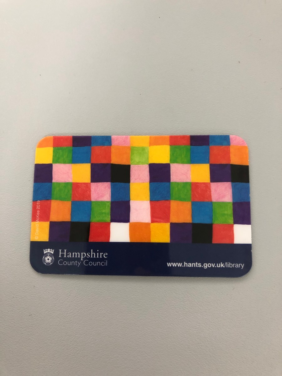
Today we were asked to get library cards to help give us a bigger variety of books to help us with our course. I got my library card from Stubbington library as it is very close to my house and easy to access. I was also thinking about getting a library card from Gosport’s library to improve the likeliness of one of them having a book that i needed. I was asked for my ID and then a few questions about me and why i wanted to rent out books. I chose this pattern on my card as it is also from a childhood book that I used to like called Elmer Elephant. I didn’t have time to withdraw a book as the library closed right as I got my card, but fortunately for me I was already reading a book prior to getting my card so I wont be left behind in the course. 

Typography Poster Homework

Typography Posters are a good way to express a lot of different emotions through the use of words. In the picture below they have used words that correlate to Albert Einstein to create an image of his face. If someone doesn’t know who Albert Einstein is they could understand a lot about him just from reading the different words used to form his face. The fact that someone has been able to create Albert Einsteins face through the use of words and shading is incredible and will keep drawing in new people to typography as will the thousands of other typography posters.

1516830551682_1024x1024.png

Knockout text poster

In today’s lesson I created a poster for Ferrari using cut-out text.

I did this by first finding a suitable picture to put in the background. I chose to use a Ferrari Enzo as I felt that it represented the Ferrari brand perfectly as it was named after the creator of the Ferrari franchise. Untitled-1

I also recreated a Poster of Mercat Del Ram VIC 2017. To do this I found an image of the bull and an image of the background and then added a white layer to go over the background and for the bull to go through the middle of. I coloured the bull black so that it fitted in ready and didn’t blend in with the other colours. I then made sure that it was perfectly in line with the lettering and the side of the poster and then made sure that it was the correct size also. Unfortunately I made an error and I saved the picture to desktop instead of saving it to my memory stick so I lost the files to the image.

Typography

In today’s lesson I increased my knowledge of typography. I tried to log onto my photoshop but my computer didn’t work and there were no other working computers available for me to use so I decided to make a list on my phone.

We used san serifs and serifs to compare how our names looked in both and to see whether or not they looked better in san serifs or if they just ended up overlapping and not working properly.


American Psycho Business Card

In today’s lesson we were asked to examine the typographical elements of ‘Patrick Bateman’s’ business card and recreate it in Photoshop. I first searched for the font used in the scene online but I couldn’t find anywhere to download it so I started to go through all of the different fonts until  found one that was extremely similar. Conveniently enough this was the last font on the list called ‘St Song’. I then wrote his name on the business card but I couldn’t write the numbers in the same font so I started looking through some other fonts and finally found the exact one that I needed.


Untitled-2

Queen Elizabeth by Annie Leibovitz

queen-elizabeth-birthday-90-annie-leibovitz-summer-2016-vf-04.jpgI have chosen this picture as I personally think that it shows a certain loneliness that the public don’t often see. I think that it’s important to see the Queen in this environment as it shows the public that having everything at your disposal can still be extremely stressful and depressing. My perception of this picture is that looks like the queen has a lot on her mind as shown by her blank expression and her never ending gaze into the distance. Just from looking at this photo I get a feeling of isolation from her facial expression.

The background of the picture is quite dark in the room which could show that there isn’t anyone else in the room with her and that she is just alone with her thoughts.